Monday, 20 January 2020

Magazines: Tatler CSP case study

Print magazine Tatler is our first Close Study Product. We need to study the media language and representation of people and groups on the front cover of Tatler (April 2017).

The key notes from the lesson are here:

General
  • Tatler is Britain’s oldest magazine (founded in 1901).
  • Targeted at upper classes and upper-middle classes.
  • Lifestyle magazine with focus on fashion; high society events such as balls and celebrities such as the Royal family and members of the aristocracy (people with inherited wealth, titles and land.)
  • There are versions in Russia, Hong Kong and Indonesia.
  • Over the years, Tatler has remained interested in the lives of the Royal family, but has tried to re-invent itself as more ‘edgy’ and modern in recent years, to try and target a younger audience. 
Watch this trailer for BBC's Posh People - a documentary about Tatler, the oldest magazine in Britain.


Media language
  • This refers to how the producers communicate their message to the audience through the media text. 
  • Mise-en-scene: what you see - remember CLAMPS (Costume / Lighting / Actors / Make-up / Props / Setting)
  • Typography / Fonts: serif title and sans serif cover lines. 
  • Words used and their connotations. 
  • Colour schemes: usually two or three in a magazine. Sometimes title matches or is juxtaposed with colours elsewhere on the cover.

Representations
  • Tend to reflect dominant representations/stereotypes on cover image: predominantly white, predominantly female, predominantly wealthy (or associated with wealth such as this actress who plays a role in Downton Abbey).
  • Average age of reader is 41 but the cover tends to focus on celebrities or models who are younger than this (due to dominant ideals of beauty in the Media).
  • Cover lines (stories inside) tend to focus on preoccupations of upper classes e.g ‘How to get your son into Eton’- an exclusive and very expensive private school.

Social and cultural contexts
  • The issues that Tatler is concerned with tend to be political but not in a particularly gritty way because the magazine is more interested in fashion, merchandise, beauty and ‘lifestyle’ rather than dealing with news in any depth. 
  • The preoccupation with parties, private schools, luxury holidays and exclusivity (the ‘Tatler Privilege Club’) assumes a high level of income and an elitist attitude which may alienate or offend people from a different social class. 81% of the readership has an above average income. 44% buy shoes or clothes more than once a month so the cultural context of the magazine could be judged as ‘niche’ (for the few) rather than ‘mainstream’ (for everyone).
  • Some of the stories can be seen as out-dated as they are concerned with riding, hunting and shooting which are pursuits generally only enjoyed by higher classes. 


Tatler: case study blog tasks

Work through the following tasks and questions to build a detailed case study for Tatler issue April 2017 (below). This will give you plenty of background information to use in an exam question on print magazines.


Introduction - Tatler Media pack

1) Look at the Tatler Media Pack. Go to page 2: how does the editor introduce the magazine?

2) Now go to page 4 of the Media Pack. Focus on the print magazine (NOT tatler.com - the website). List the key demographic details: age, gender %, ABC1 % (social class), HHI (Household Income), % of those living in London and the South East. What do these demographic details suggest about the average Tatler reader?

3) Look at page 6. What do Tatler readers think about fashion? How much do they spend?

4) Go to page 10. What are the special editions of Tatler that run throughout the year? What does this suggest about the pyschographic groups who read Tatler?


Media language


Revise the 12 magazine cover key conventions and check how many feature on this edition of Tatler.

1) What different examples of typography can you find on the cover of Tatler? What are the connotations of the serif and sans serif fonts? 

2) How do the cover lines appeal to the Tatler target audience?

3) What are the connotations of the Tatler colour scheme on this particular front cover?

4) How is the central image designed to create interest in the magazine? Find three reasons for your answer. (E.g. Mise-en-scene such as props, costume and make-up, body position, facial expression)


Representations

1) What different groups of people are represented on the cover? (E.g. men/women/white people etc. Look at the image and text/cover lines to help here)

2) What do the cover lines suggest about the lifestyle of rich people in the UK?

3) Are there any stereotypes being reinforced or subverted? How? Why?

4) What would be the preferred and oppositional readings to this cover of Tatler?


Social and cultural context

1) What aspects of British life or people are NOT reflected in Tatler? (Watch the clip above again if you need help with this - the clue is in the title 'Posh People')

2) Tatler runs special issues on holidays, spa breaks, cosmetic surgery, watches and jewellery and private schools. What does this suggest about the magazine's representation of life in Britain?

3) What audience groups might be offended or insulted by the front cover of Tatler April 2017? 

4) Find three other front covers for Tatler. What issues, subjects or people are regularly featured in Tatler?


Grade 8/9 extension tasks

1) Are there any misrepresentations or under-representations of groups? What might this suggest about the target audience?

2) How does the front cover engage audiences with possible narratives? Look for stories, cliffhangers, dramatic cover lines etc.

3) What does the costume and make-up in the central image suggest about the character featured on the front cover of the April 2017 edition of Tatler?

4) Read this Guardian article on the BBC documentary about Tatler called Posh People. What does the article suggest about the people who produce and read Tatler?

Complete for homework - due Thursday 7 February.

Thursday, 16 January 2020

Introduction to Media: Final index

We have now completed our introduction to GCSE Media Studies - and it's amazing how much content we've already covered.  

This even includes TWO of our actual exam Close Study Products - the two Film Industry CSPs (Doctor Strange and I, Daniel Blake). 

We now need to create an index of all our blogposts so far this term. This process is an excellent start to our ongoing revision and will also highlight if you've missed anything through absence or trips. Your index should include the following:

1) Introduction to the subject and you
2) Key concepts (LIAR) and analysis of Film Poster
3) Denotation and Connotation: Advert analyses (WaterAid)
4) Mise-en-scene: Stranger Things
5) Blog feedback and learner response
6) Camera shots photo storyboard (photos and captions)
7) Camerawork and editing blog tasks
8) October assessment – feedback and learner response
9) Reception theory – Harry Brown trailer analysis
10) Audience effects theory - Blue Planet analysis
11) Industries - Ownership and control (Facebook and Instagram)
12) Audience and Industry - impact of internet essay
13) Film Industry: Introduction to Marvel
14) Film Industry: Doctor Strange
15) Film Industry: I, Daniel Blake
16) Audience and Industry internet essay - feedback and learner response
17) Representation: Kidulthood film poster analysis
18) January assessment learner response

For your index, the text should link to YOUR corresponding blogpost so you can access your work quickly and easily for checking and revision. This also means if you have missed anything you can catch up with the work and notes and won't underperform in assessments and exams due to gaps in your knowledge.

Creating your index

To create your index, first copy the list of work above and paste it as plain text into a new blogpost called 'Introduction to Media: Final index'. Then, open your Media blog in another tab and use your blog archive to open up all your work from last term. For each post, copy the URL - this is the web address that will end .blogspot.com/name of the post. For example: 

https://mediamacguffingcseyear1.blogspot.com/2020/01/representation-introduction.html

Once you've got the hang of it, you should find the index only takes 10-15 minutes to produce.

January assessment: learner response

Well done on completing the January assessment - the more we practice these questions the more confident we'll be in the exams next year.

The first part of your learner response is to look carefully at your mark, grade and comments from your teacher. If anything doesn't make sense, ask your teacher - that's why we're here! 

Your learner response is as follows:

Create a new blog post called 'January assessment learner response' and complete the following tasks:

1) Type up your feedback in full (you don't need to write the mark and grade if you want to keep this confidential).

2) Read the mark scheme for this assessment carefully. Write down the mark you achieved for each question:

Q1:
Q2:
Q3:
Q4: 
Q5:
Q6:

Where you didn't achieve full marks, write WHY you think you missed out on the extra marks. Use the indicative content suggestions in the mark scheme to help with this.

3) Did you get any media terminology wrong in the assessment? Make a note of it here for future revision:

4) Look specifically at question 3 - did you successfully write about both the preferred and oppositional readings? Did your answers match any in the mark scheme?

5) Now look at question 4. Write a definition of vertical integration to revise this key industry terminology.

6) Finally, look at your 20-mark essay - question 6. Write a four-paragraph essay plan for this question, using the suggested answers in the mark scheme to help you. Use this format:

Paragraph 1: 
Paragraph 2:
Paragraph 3:
Paragraph 4:

Your learner response must be published before you leave the lesson.

Monday, 13 January 2020

Typography: Photoshop workshop

Typography is a crucial aspect of communicating meaning to an audience.

"Typefaces give voice to words"

There are two main terms that we need to learn:


Serif
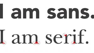
Serif fonts have tabs (or 'feet') at the corners of the letters. Serif fonts are more old fashioned, traditional or authoritative. They are particularly suited to long passages of text as they create a 'line' for the reader to follow.

Sans Serif
Sans Serif fonts are more modern and do not have tabs or 'feet' on the letters. They are used for titles, headings and create a more contemporary, modern feel to the product.


Typography: Photoshop workshop

Task 1

Create an A4 document in Photoshop. Choose a font to represent the following words (you may need to Google their meanings).

Think about:
UPPER or lower case? Font size? Angle? Position on page?
  • Mistake
  • Harmony
  • Falling
  • Personality
  • Elastic
  • Emperor
  • Brittle
  • Globe
  • Radiation
  • Relax
  • Madness

Task 2

Choose three of the words and create an instant graphic identity for each (see image right). Use the tools, effects and colour available in Photoshop. 


Task 3

Create your own magazine and design a graphic identity for it in Photoshop. 

Choose a font which represents the name
Add an image, shape, colour or slogan that combines with the name to create a brand identity for the magazine.

You will have lesson time to work on this - it will not be set for homework.

Monday, 6 January 2020

Representation: an introduction

Representation is a vital key concept in Media Studies: how are people, social groups, places and issues represented in the media?

We need to able to analyse media texts and discuss whether representations are fair, accurate, stereotypical or unusual based on our knowledge of the media and the way texts are constructed.

Social and cultural contexts

Whenever we study a media product, we need to think about how it reflects British society and what message it may be sending to audiences.

Social contexts: How do media products influence or affect people in society?

Historical contexts: How has society (and media products) changed over time?


Cultural contexts: How the media reflects the typical ideas, opinions and beliefs in society.


Representation

What is Representation?
  • The way the media portrays the world. 
  • The media takes a story/set of facts and (re)presents them in a certain way. 
  • In Media Studies we are particularly interested how the media portrays events, issues, individuals and social groups.
  • Some groups are misrepresented (represented inaccurately) or under-represented by the Media.
It is the combination of media language choices that construct the representation audiences see. Indeed, everything we see in the media is a re-presentation because the media intervene or stand between the object they are presenting and the audience and therefore they affect or ‘mediate’ every text we see! 

Stereotypes
  • Media messages have to be communicated quickly which often means relying on stereotypes
  • A stereotype is a standardised, oversimplified picture of a person, group, place or event.
  • Stereotypes act like codes that give audiences a quick, common understanding of a person or group of people—usually relating to their gender, class, ethnicity or race, sexual orientation, social role or occupation.

How are representations created?
  • In print media (news and magazines), a picture editor selects the photo from a whole series of images to be used to illustrate a news story. The image may be cropped, resized and, in some cases, photoshopped so it does not reflect reality.
  • A news editor will decide on the way the news story will be presented, and the use of captions to affect the meaning of the image. 

Glossary words

Conventional- typical, the usual, expected representation. 
Subversive- untypical or unexpected representation, differing from the norm.
Stereotype- A ‘set’ idea that people have about what someone or something is like (not necessarily accurate).
Mediation- process by which texts are presented and received.
Representation- how groups or events or individuals are presented / portrayed.


Representation: blog task


Create a new blogpost called 'Representation'.

Look at the film poster for Kidulthood above and answer the following questions on your blog:

1) List the people, places and groups represented in the poster. E.g. men, women, teenagers etc.

2) Are there any stereotypes you can identify?

3) What is the preferred reading of this poster?

4) What is the oppositional reading of this poster?

Extension: What does this poster suggest about British society? 

Audience: Effects theory

As well as studying target audience and reception theory, we also need to explore WHY audiences enjoy using and interacting with the media a...