"Typefaces give voice to words"
There are two main terms that we need to learn:
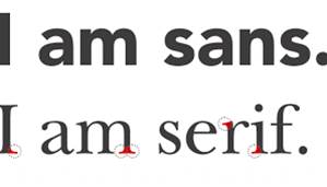
Serif fonts have tabs (or 'feet') at the corners of the letters. Serif fonts are more old fashioned, traditional or authoritative. They are particularly suited to long passages of text as they create a 'line' for the reader to follow.
Sans Serif
Sans Serif fonts are more modern and do not have tabs or 'feet' on the letters. They are used for titles, headings and create a more contemporary, modern feel to the product.
Typography: Photoshop workshop
Task 1
Create an A4 document in Photoshop. Choose a font to represent the following words (you may need to Google their meanings).
Think about:
UPPER or lower case? Font size? Angle? Position on page?
- Mistake
- Harmony
- Falling
- Personality
- Elastic
- Emperor
- Brittle
- Globe
- Radiation
- Relax
- Madness

Choose three of the words and create an instant graphic identity for each (see image right). Use the tools, effects and colour available in Photoshop.
Task 3
Choose a font which represents the name
Add an image, shape, colour or slogan that combines with the name to create a brand identity for the magazine.
You will have lesson time to work on this - it will not be set for homework.


No comments:
Post a Comment